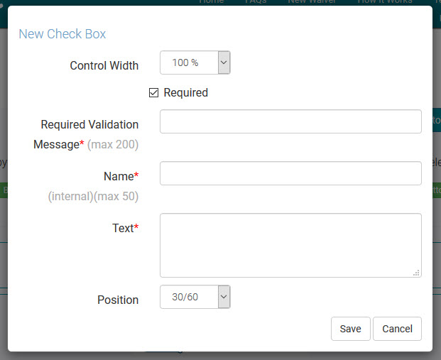
Online Waiver Checkbox Control
Follow or reference these easy steps for building your online form. You can return to this page at any time during the process.
Email us at support@webwaiver.com with any questions.

Common Control Fields
- Control Width - Choose how wide your want this control to be on your form. Choices are 33%, 50%, 66%, and 100%. Setting two controls to 50% will display them side by side.
- Required - Check this box if your visitor must complete this field in order to submit your waiver.
- Required Validation Message - For required controls, you must set a Required message for the visitor in case they skip this field and try to submit the form.
- Name - This is an internal identifer for your waiver Checkbox control. It is used as the field name in exports.
- Text - This is the label/text that will be displayed next to the checbox on your online waiver.
- Position - The Checkbox control has three display layouts. 30/60 will uses 60% of the available space for text. Left uses 100% of the space with the text left justified. Center uses 100% of the space with the text center justified.

